
Delta Dental
Delta Dental is expanding into ancillary products — but the enrollment experience hadn't kept pace. Redundant steps, unclear progress, and growing product complexity were frustrating the brokers and employers who depend on it most.
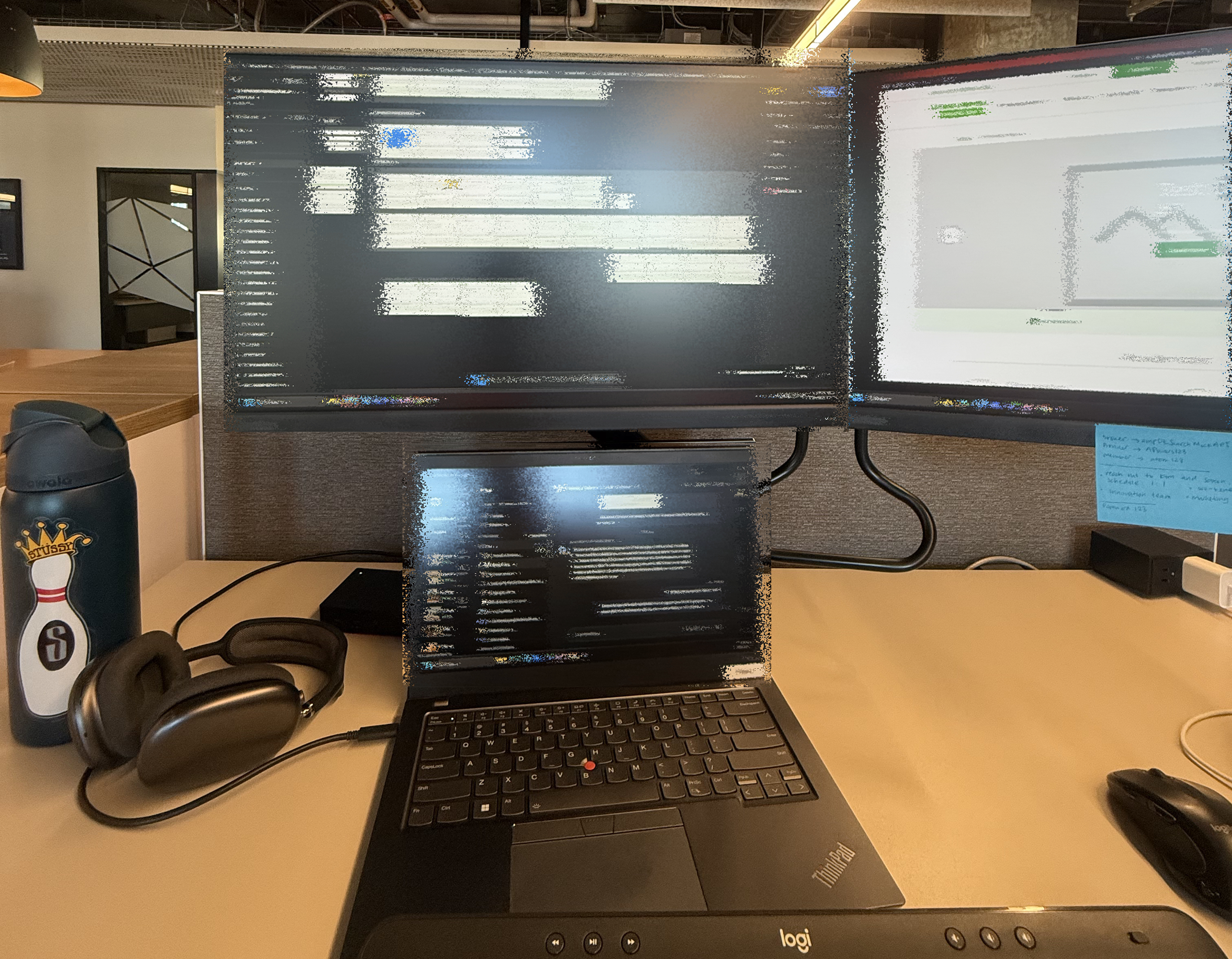
A UX internship at Delta Dental, redesigning the broker and employer enrollment experience as the company expanded into ancillary insurance products. Growing complexity had introduced redundant steps and unclear progress — making an already demanding B2B flow harder to navigate.
I joined a cross-functional team mid-project, owning design from discovery through developer handoff — research, wireframes, hi-fidelity screens, and usability testing.
Delta Dental is expanding beyond dental into ancillary products — vision and other insurance offerings. This expansion meant more products, more options, and more configuration decisions layered on top of an already complex enrollment experience.
Brokers and employers are the primary users responsible for enrolling groups into coverage plans. As more product lines were added, the existing flow's redundancies became harder to ignore — and harder to navigate.
The existing enrollment flow had accumulated friction over time. Adding ancillary products didn't just expand the flow — it compounded the existing problems, making an already opaque process even harder to trust.
Redesign the end-to-end enrollment flow for both brokers and employers — reducing redundancy, clarifying where users are in the process, and building a foundation that can accommodate ancillary products without breaking the experience.
Users were asked for the same information in multiple places. Without a clear sense of progress, it was hard to know what still needed to happen — or what had already been done.
Enrollment involves many sequential decisions. Without a visible progress model, users couldn't track their position — or how much work was left.
Ancillary expansion added new product lines to a flow that wasn't designed to hold them. The result was confusing navigation and unclear branching between product types.
Brokers and employers have different relationships to the enrollment process but shared an undifferentiated experience — causing friction for both, for different reasons.
With the UX researcher on leave, the process required some improvisation — particularly during discovery. Each phase built directly on the last.
This summer, I interned at Delta Dental of Washington on Triforza's Digital Platform Team, where I led end-to-end design of the new enrollment flow for Brokers and Employers.
I started by breaking down the existing workflow to identify pain points, then collaborated with Brooke K. (PM Intern) to refine our user research interviews and Product Requirements Document. From there, I translated those insights into mid-fidelity and high-fidelity designs, and conducted usability testing to validate the direction.
Before taking on the enrollment flow, I had the chance to work on other projects, including refining the Multi-Factor Authentication (MFA) experience and the Provider Claims Dashboard.
I also worked closely with engineers based in Ireland, and initiated a design change log so teams could review updates asynchronously, on their own time. The product is currently in development, and I'll share more once it officially ships.
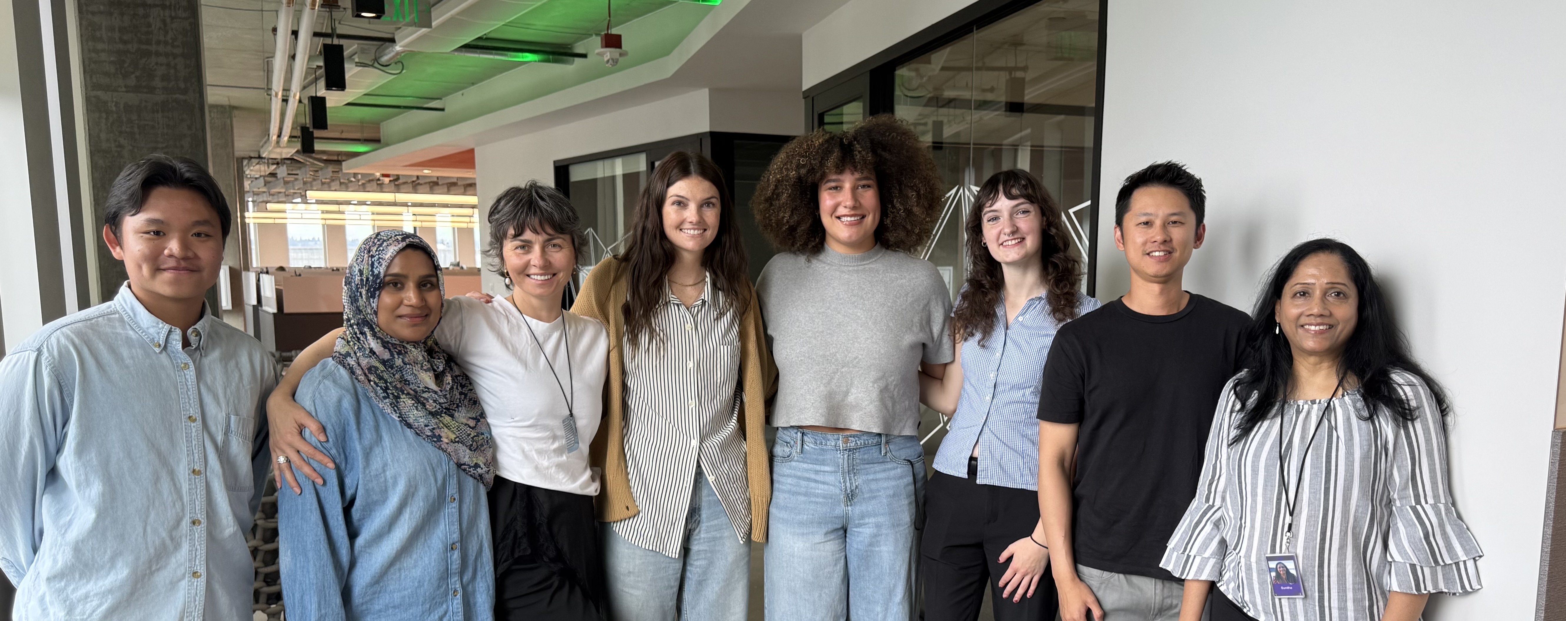
Grateful for this opportunity and for the chance to work alongside fellow designers, PMs, engineers, and all the stakeholders who shaped this project. A special thank you to my mentors, Jessie Brown (Designer) and Kimberly Lum (UX Marketing Manager). Lots of lessons learned, lots of caffeine involved, and a great summer in Seattle.
Sté is short for Steven— and it's a small wink at stay. It's the thread running through my work: design that invites people to stay engaged, art that holds attention, fragrances that linger long after the wearer leaves the room. Welcome. Sté with me a while.